POGO
An Interface design for local bicycle rental
A Three Day interface design project which focused on designing a platform to help people explore, decide and book a bicycle that they can pick up and use for the booked time.
Project Interface Design
Duration: 3 Days
Role: UI/UX Designer
Problem Statment
How might we build a bike renting platform that gives user hassle free riding along with facilitating them through the experience of exploring a bike, booking and deciding a bike.
IDEATION
Mind Mapping
This brainstorming process allowed me to quickly map out all aspects of the app flow from both drivers and riders. From here I was able to categorize the clusters and build in an INFORMATION ARCHITECTURE for the platform.
SOLUTION
Low -Fi Screens
I started with hand sketching some rough ideas of what users would like to see in a potential solution. After reviewing the sketch and flows, I moved them over to sketch and organized the flows of clarity.
Mid - Fi Screen
I began to digitize all of my low - fidelity flows and design further providing a larger scope of the functionality of my app.
User Testing Feedback
I was given the opportunity to user test with 4 users. They provided me with insights on what to change and improve from Mid Fidelity Mockup to the final. Some of the Insights were
Hi - Fi Screens
Bottom Navigation: Used bottom navigation as it can be easily accessible with one hand as well. With scan as a major CTA.
Map based Search: Map displays number of cycles available at each center, One the user clicks on the center it takes him to a product list page.
Vertical Product List: Have used Vertical product list Instead of horizontal - during user testing reasoned that horizontal list was difficult to navigate through
Cards for future: Cards of product listing page are made in such a way that it can hold longer or shorter bike names, Designed keeping in mind scaleable content.
Interactive Prototype
Explore, Choose, Rent
Bottom Navigation: Used bottom navigation as it can be easily accessible with one hand as well. With scan as a major CTA.
Map based Search: Map displays number of cycles available at each center, One the user clicks on the center it takes him to a product list page.
Vertical Product List: Have used Vertical product list Instead of horizontal - during user testing reasoned that horizontal list was difficult to navigate through
Card for future: Cards of product listing page are made in such a way that it can hold longer or shorter bike names, Designed keeping in mind resizable content.
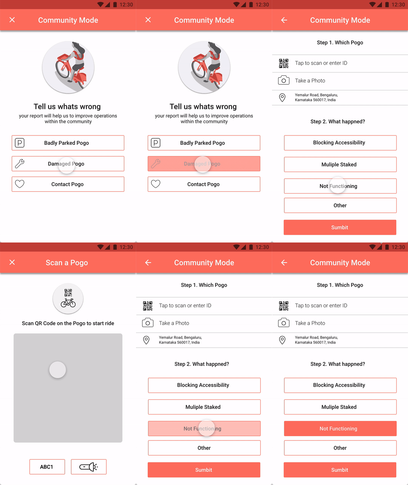
Community Mode
Through user feedback, helps keep business in check. A great way to create a report for fixing and servicing bikes.
To give Users good quality service.
Takeaway
I learned how to get started with a project with out actually conducting research just starting with assumptions, made tons of mind maps to encode the process be clear about all the deliverables required from the designer’s end. I received tons of feedback during user testing the information layout and interactions, these feedbacks were incorporated in the final design.


