RE-THINKING HOLIDAYS
Redesigning the entire Holidays funnel for MakeMyTrip
📋 About
Redesigning Holidays was a project done for MakeMyTrip Holidays. The aim is to help users discover their dream destinations and book it online worry free.
📱Status
In Development
🙋My Role & Team
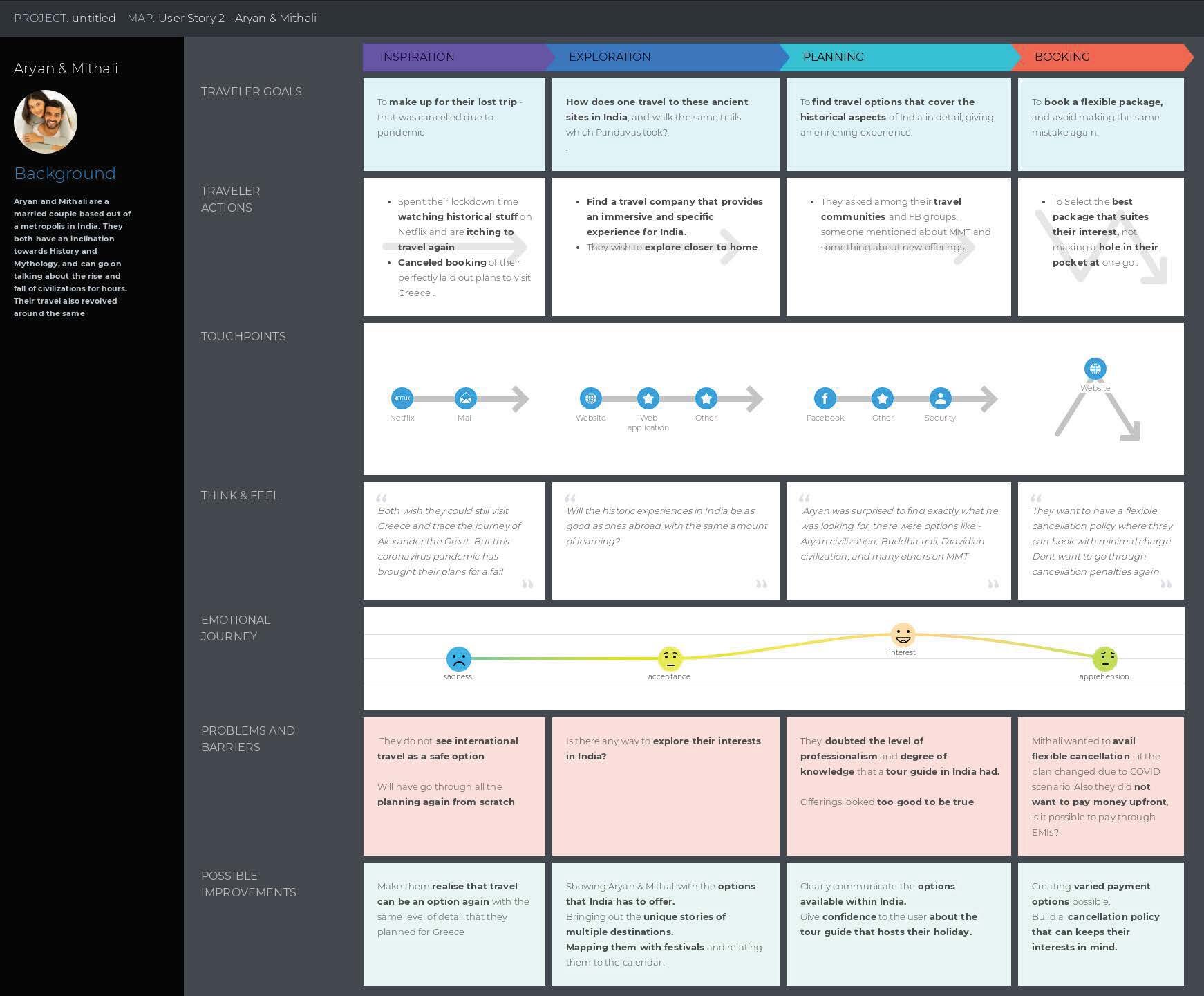
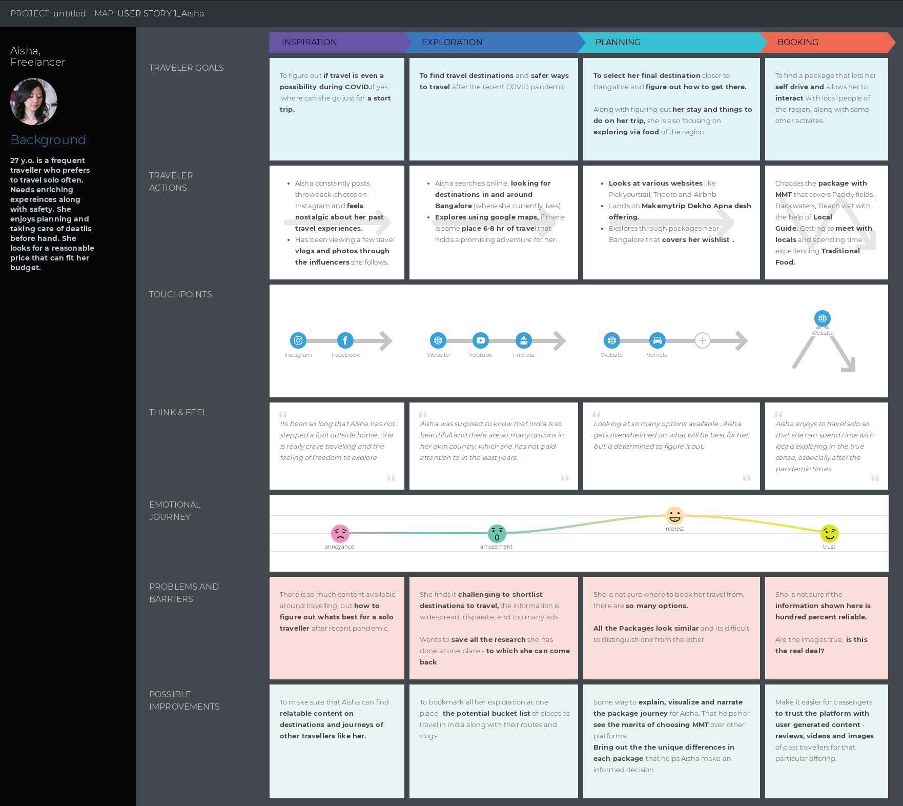
1 Product Designer, 1 Visual Designer, 2 Project Managers. I collaborated with the PMs to identify gaps for the redesign, curate user stories, and build the framework supporting it.
⏳Duration
3 - 4 Months of Designing
Understanding thy user


What dose the existing experience look like?
Problem Statement & Goals
How can we help users make confident choices online? Buy worry free online? Get reassured and come back with stories?
Information Architecture
Guiding principles for Redesign
LANDING PAGE COMPONENTS
Redefining Search
The current search bar misses the suggestion or guiding part - It only helps when the user has a clear goal.
Menus would give the user a way to discover content - when they don’t know what to look for - they can easily jump to pages - understand how we have structured the information.
Types of Cards - Landing Page
We put together a variety of cards to enable our new vision
● Intent Discovery Cards ● Cross Navigation Cards ● People Cards - Humanising Element ● Assurance Banners
Full Landing page
LISTING PAGE
Package Listing Card
Curating vertical cards as they are easy to compare when placed next to each other. We had three types of variants among the cards.
● Generic Card ● MMT Signature Card ● Signature with Host Cards ●
Full Listing page
This is how the combined structure of the listing page looks like: showing people what they can expect.
We created easy to navigate structure through suggestions embedded along the way to help the user make sense of information. Curated package cards in categories that would be easy to digest and reduce cognitive load it will have banners.


